


Choosing a colour for a collectible display frame is not just a matter of matching the furniture. The aluminium finish, the background surrounding each item and the colours already present in the collection all influence how the finished display looks. A row of graded Pokémon cards will read differently against black than it will against white, and the same gold frame can appear understated or prominent depending on the artwork, wall colour and lighting.
This guide explains how to choose a display frame colour for graded trading cards, One Touch magnetic holders and physical video game cases. It covers black versus white EVA foam, silver and gold aluminium frames, titanium and bronze finishes, brighter colours, multi-card grids, gaming room design and practical ways to preview combinations before ordering. The aim is to make colour choices easier, whether the display is built from inexpensive stands and shelves or a purpose-fitted aluminium wall frame.
There is no single best colour. The useful question is which combination makes the collection easy to see, suits the room and will still look considered when the items inside change.
Start with the collection, not the frame
Before comparing frame finishes, look at the objects being displayed. A collection of holographic Pokémon cards often contains strong contrasts and varied hues. A set of black-and-white sports photographs may be much more restrained. Nintendo Switch box art can produce a visually busy wall, while a row of PlayStation titles may be linked by similar case colours and spine labels.
Start by deciding what should draw attention first. In most cases, the answer should be the cards, graded slabs or game cases. The frame can support that goal by remaining neutral, picking up an existing accent colour or deliberately providing a stronger border. A good combination does not have to match every colour in every piece of artwork.
If the collection contains dozens of unrelated colours, choose a relatively calm frame-and-background combination. If the collection has a defined theme, such as a team colour, a five-card Magic: The Gathering colour cycle or one game franchise, a more expressive finish may make sense.
Three colour decisions that shape a display
- Aluminium frame finish: the visible outer edge and its relationship to the wall and surrounding décor.
- Background colour: the black or white EVA foam surrounding the holder or case, which can change perceived contrast more than the outer frame does.
- Collection colours: the artwork, grading labels, game-case packaging and any repeated colours across a series.
A frame can look dramatically different when only one of these is changed. For that reason, assess the frame and background together, rather than selecting a metallic finish first and treating the background as an afterthought.
How contrast changes the way collectibles look
Contrast is the difference between light and dark areas or between colours that stand apart visually. It helps explain why colourful cover art may look more vivid against black, and why a white background can make a dark object seem more clearly separated from its surroundings.
Black does not physically increase the colour saturation of a card or game cover. Instead, the darker surrounding area can change how the eye perceives those colours. White does not make the artwork brighter, either; it changes the comparison around it. Room lighting, glossy holders and display reflections can influence the overall effect.
One useful test is to photograph the same collectible against black paper and white paper in the room where it will be displayed. View the photos at normal size rather than zooming into the artwork. The more successful option is often obvious when the entire composition is visible.
Black EVA foam versus white EVA foam
The background is sometimes described as an insert or mount, but in a fitted collector display it also determines the visual spacing between items. SLABBED's aluminium display range offers black and white precision-cut EVA foam options for compatible configurations. The chosen background is designed to work with the selected holder or game-case format, rather than simply placing the collectible onto a flat decorative sheet.
| Consideration | Black EVA foam | White EVA foam |
|---|---|---|
| Overall appearance | Darker, more contained presentation | Lighter, more open presentation |
| Bright artwork | Often creates strong perceived contrast | Can make the overall display feel less visually heavy |
| Dark artwork | May blend into the background around its edges | Often defines the edges more clearly |
| Mixed collections | Helps unite different artwork colours | Gives mixed artwork more separation |
| Room pairing | Works well in dark gaming rooms and modern interiors | Works well against pale walls and lighter furnishings |
| Appearance in photographs | Can show lint and dust under directional light | Can show darker marks or handling dirt more clearly |
Neither colour is inherently more protective or more valuable. The correct choice is mostly aesthetic, subject to the actual materials and construction used. If the goal is to display colourful games or cards against a dark, uniform field, black is a logical starting point. If the goal is a brighter gallery-like arrangement with clear separation between items, white is worth considering.
Why matching the backboard to the EVA foam matters
In a layered display, the front background is not always the only coloured surface visible. Depending on the frame's construction and viewing angle, the area behind the fitted material can affect the finished appearance, particularly around openings and edges.
For SLABBED's fitted aluminium displays, the acrylic backboard colour is matched to the selected black or white EVA foam. That keeps the background visually consistent rather than introducing a contrasting colour behind the openings. It is a small design decision, but one that becomes more noticeable across a large multi-item grid.
The backboard colour should not be confused with the UV specification of the clear front glazing. These are different components with different purposes. The background choice affects appearance; the clear front's optical and UV properties should be assessed separately.
Black aluminium frames: restrained and adaptable
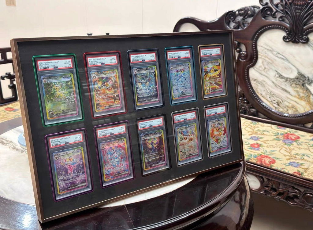
A black aluminium display frame is a versatile option because it does not compete strongly with most artwork. It works with PSA and CGC graded slabs, One Touch holders, sports cards, Pokémon illustrations and video game covers with widely differing colour palettes.
Black frame with black EVA creates a continuous dark field around a collection. The outer border is relatively quiet, allowing the objects to carry the colour. Black frame with white EVA produces a sharper graphic contrast: a dark outline around a light interior.
Black is not universally the best choice. On a very dark wall it can lose definition, and a collection made up mainly of black or navy artwork might benefit from a lighter background. In those circumstances, silver, titanium or white foam may give the arrangement more separation.
Silver aluminium frames: light, contemporary and neutral
Silver aluminium display frames offer a cooler metallic border. They are useful when the collector wants the frame to be visible without introducing a strong decorative colour. Silver often pairs naturally with neutral furniture, technology-focused rooms and cases with white or blue packaging.
Silver with black EVA can give colourful game covers a precise border against a darker centre. Silver with white EVA appears brighter and more gallery-like, particularly against pale walls. The choice often comes down to whether the collection should stand out as a dark feature or blend into a lighter room.
Silver can also work well with graded sports cards, monochrome illustrations, modern full-art Pokémon cards and PlayStation collections, although the artwork itself should remain the final deciding factor.
Titanium, gunmetal and textured grey: alternatives to black and silver
Collectors sometimes want a neutral frame without choosing pure black or bright silver. Titanium, gunmetal and textured grey finishes occupy useful positions between those extremes. They can make the frame visible on a dark wall without drawing as much attention as gold or saturated colours.
These finishes are especially suited to mixed graded card collections, modern gaming rooms, home offices and displays featuring several console generations. They can also help connect a collection with grey furniture, metal shelving or neutral wall colours.
The names of finishes do not guarantee that two suppliers' colours will look identical. Metallic surfaces change with lighting and viewing angle. Where possible, assess the actual finish rather than relying only on its name.
Gold aluminium frames: warm accent or main feature?
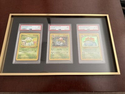
A gold aluminium frame creates a warmer, more noticeable perimeter. It can complement gold-foil cards, championship sports memorabilia, vintage-inspired rooms and selected video game artwork. On a feature wall, gold may be the visual accent that makes an otherwise restrained arrangement feel intentional.
With black EVA foam, gold reads clearly as an outer border around a dark collection area. With white EVA, the combination is brighter and can take on a more traditional framed-art character.
Gold works best when it has a reason to be there. It may suit a trophy card, a complete premium set or a collection with warm artwork. In a room already filled with saturated colours, however, a gold frame can compete with the objects inside. It is worth comparing with black or titanium before committing.
Bronze, rose and espresso: warmer alternatives
Warm metallic and deep neutral finishes can provide much of gold's warmth with a different emphasis. Bronze may coordinate with timber desks, warm wall colours and vintage-inspired collections. Rose tones can complement selected pastel and red artwork. Espresso can create a quieter border in rooms where black feels too stark.
These are design tendencies rather than fixed rules. A bronze frame does not automatically suit every retro game, and rose does not need to be reserved for particular characters or card types. Look at how much of the chosen colour already appears in the room and whether repeating it creates balance or visual clutter.
Coloured aluminium: when to use violet, blue, green, red or tangerine
A colourful aluminium frame is a deliberate styling choice. SLABBED's published range includes options such as violet, sapphire blue, slate blue, forest green, sage, cherry red and tangerine, alongside its neutral and metallic finishes. Availability depends on the product configuration.
Strong colours can work particularly well when a collection has a clear theme. A blue frame might coordinate with water-themed Pokémon art or a cool-toned PlayStation collection. Green can pick up a game room's colour scheme or complement certain nature-themed artwork. Violet may suit a purple-led card arrangement, while red or tangerine can echo selected cover art.
The risk is repetition without restraint. A red frame, red wall, red lighting and red-heavy cover art can merge into one overwhelming field. If the frame is the strongest colour in the room, allow the background and surrounding décor to remain simpler.
Frame finish comparison: which colour fits which collection?
| Frame finish | Often suits | Consider before choosing |
|---|---|---|
| Black | Mixed cards, colourful artwork, dark rooms | May blend into very dark walls |
| Silver | Modern rooms, clean collections, cool tones | Can feel prominent against dark backgrounds |
| Titanium / grey | Neutral interiors, mixed slabs, subdued displays | Metallic shades vary under lighting |
| Gold | Warm rooms, trophy pieces, accent displays | Can compete with busy artwork |
| Bronze / rose | Warm neutrals, selected vintage and pastel themes | Test with wall colour and furniture |
| Violet / blue / green / red / tangerine | Strong franchise, team or character themes | Best used as a controlled accent |
| Matte white | Light interiors, minimalist gallery arrangements | Can disappear against similarly white walls |
This table is a starting point, not a compatibility chart. A frame colour does not alter whether an opening fits a PSA slab, BGS slab, One Touch holder or game case. Physical compatibility must be selected separately.
Choosing frame colours for Pokémon card displays
Pokémon collections can be organised by set, Pokémon type, character, artist, rarity or colour. That creates several ways to coordinate the display without matching every card individually.
Mixed Pokémon collections
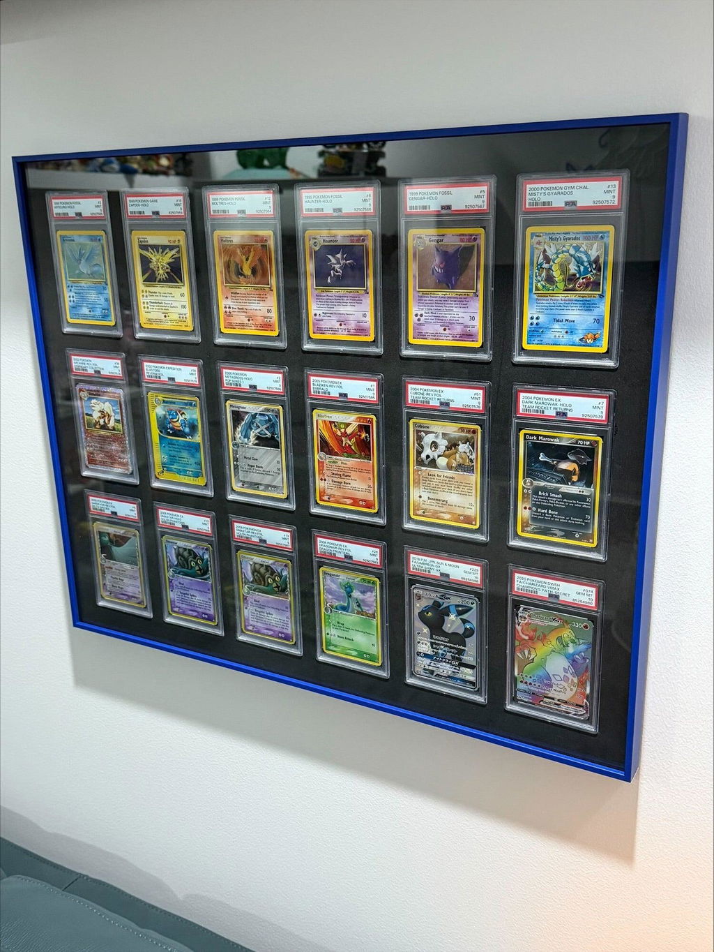
A mixed wall of PSA or CGC Pokémon slabs often has enough colour already. Black, silver and titanium usually provide a calmer border. Black foam can help unite varied cover-like artwork, while white gives each slab more apparent breathing room.
Character and evolution-line displays
A Charizard or fire-type collection might support a warmer finish such as bronze, gold or tangerine. A water-themed arrangement might suit silver or blue. These are optional visual references, not rules. Matching the frame to every card's dominant colour can be less effective than choosing one consistent accent for the entire evolution line.
Vintage and modern Pokémon together
Older card artwork and modern full-art illustrations may have different colour densities. A neutral frame can help them sit together. Another approach is to keep the frame colour consistent while using separate layouts for different eras.
Magic: The Gathering, Yu-Gi-Oh!, One Piece and Lorcana colour ideas
In Magic: The Gathering, colour identity provides a ready-made organising system. A five-colour display could use a neutral frame to keep white, blue, black, red and green visually distinct. A single-colour deck showcase may support a stronger matching finish.
Yu-Gi-Oh! collections built around Blue-Eyes, Dark Magician, Cyber Dragon or other archetypes can use a subtle frame accent without reproducing the entire card palette. Silver and titanium are often effective for cooler artwork; black keeps dense holographic designs prominent.
One Piece and Disney Lorcana alternate-art cards already carry significant visual complexity. Neutral frames often allow character illustrations and foils to remain central. A colourful frame may still be useful when it ties a collection together by character, crew or ink colour.
Sports card frames: team colours, jerseys and trophy collections
Sports card collectors have different visual priorities from TCG collectors. A collection might feature one athlete across several teams, a complete championship roster or a series of signed cards and memorabilia patches.
Black and silver remain flexible choices for mixed athletes and teams. Gold or bronze can work for championship or trophy-themed displays, while more colourful finishes can echo a particular team identity. Avoid assuming a popular team colour is automatically the best border; consider whether the team colour is already strongly represented in the cards.
For signed and memorabilia cards, lighting and the holder format matter as much as styling. A good-looking frame should not require removing cards from protective holders or placing valuable autographs in direct sunlight.
PSA, CGC, BGS and One Touch holders change the visual balance
Graded trading cards have their own clear holders and labels. PSA, CGC and BGS slabs differ in dimensions and presentation, and the labels themselves contribute extra colour and visual weight. One Touch magnetic holders look different again, often with a darker top closure or a clearer uninterrupted view of the card.
That means a frame that looks excellent with one slab format may look different with another, even when the artwork is similar. For example, a collection of black-label-style holders may visually connect with a black background, while a mixed set of white-label slabs may stand out more strongly against it.
Always choose holder compatibility before selecting the colour combination. A black frame does not make a PSA opening compatible with BGS or a video game case. For dedicated options, compare the SlabVault graded slab displays and MagVault One Touch displays.
Choosing colours for PlayStation, Xbox and Nintendo game cases
Physical video game covers behave differently from graded cards visually. A game case is larger, may include a prominent coloured plastic border and often has more typography than a trading card. A wall of game cases can therefore become colourful quickly.
Nintendo Switch and Switch 2 displays
Red case spines and varied game artwork give many Nintendo collections a clear visual identity. Silver with black foam can be a restrained combination, while black with black foam can leave the red packaging as the dominant accent. White foam can also produce a bright, organised result if the room is light.
PlayStation displays
PS5, PS4, PS3 and PS2 cases can differ in packaging style, size and thickness. Their blue, black or other case features may contribute a consistent theme in a collection. Neutral aluminium finishes can work across generations without forcing one era's packaging to dictate the entire wall's colour.
Xbox displays
Original Xbox, Xbox 360, Xbox One and Xbox Series X collections can bring different green packaging elements and artwork styles together. A black or titanium frame can keep the overall composition stable, while a green finish can be used deliberately when the room has a strong Xbox theme.
Game-case formats should be measured and fitted appropriately. Matching the frame colour does not make different generations interchangeable. The GameVault collection shows how a consistent display format can be applied to selected console cases.
Should the frame match the wall or contrast with it?
A frame that closely matches the wall can blend into the room, leaving attention on the collection. A contrasting frame creates a stronger outline and can help a single display stand out. Neither approach is inherently more refined.
On a dark olive, charcoal or navy wall, silver, gold and white-edged combinations may be clearly defined, while black can create a more integrated look. On a white wall, black and titanium establish an obvious border; white and silver tend to feel lighter.
Consider the wall from the distance at which people normally view the collection. An effect that looks dramatic in a close-up product photograph may be subtle across a living room. Conversely, a bright colour that feels understated on a small sample may dominate a large multi-grid frame.
How room lighting changes metallic finishes
Metallic frame finishes reflect room light differently from matte surfaces. A gold profile may appear warmer under warm-white lighting; a silver profile can look cooler under daylight or cool-white lamps. Nearby coloured RGB lighting can change how both frame and artwork appear.
If possible, compare finishes under the lighting the collection will actually receive. A showroom photograph is useful for understanding the design, but it is not a perfect prediction of how a particular finish will look on your wall.
For valuable cards and game covers, use thoughtful lighting rather than intense illumination simply to make the frame appear brighter. Avoid prolonged direct sunlight and consider the cumulative effect of visible light as well as UV. More on this in the acrylic and UV specifications guide.
Black or white foam in a small single-item frame
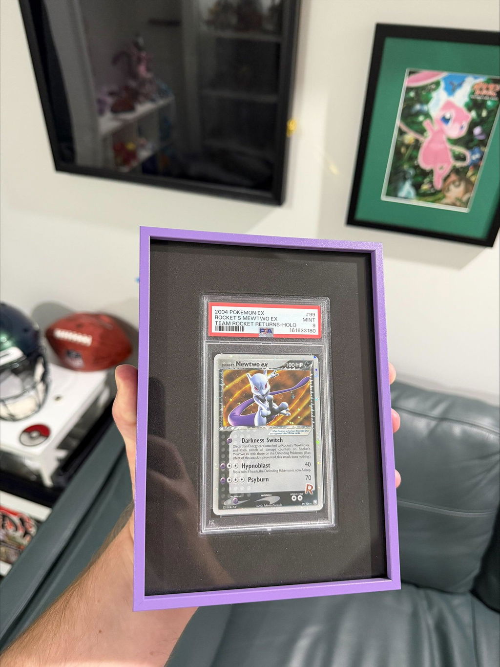
A one-card or one-game display has very little repetition to unify the composition, so the background has a noticeable effect. Black can make a colourful favourite look concentrated and contained. White often makes a single dark-edged item easier to distinguish from the surrounding area.
Single-item displays also depend heavily on scale. A small PSA slab on a large wall may need a deliberate position, or it can be combined with another display, print or shelf. The frame colour should support that arrangement rather than compensate for a wall composition that lacks balance.
Colour choices in large multi-grid displays
In a nine-card, 16-game or 36-slab wall display, the background becomes a repeated visual field. Tiny differences in spacing, edge definition and colour consistency become more noticeable because the eye reads the entire arrangement as a pattern.
Black backgrounds can unify highly varied card artwork. White backgrounds create visible space between items and may give larger arrangements a lighter overall impression. Large gold or bright-coloured frames occupy more of the viewer's field of vision, so it becomes increasingly useful to test whether the finish competes with the content.
Before choosing a colourful outer frame for a large grid, imagine looking at it from the doorway. Does the collection remain the first thing you notice? If not, a more neutral profile may produce a stronger result.
One finish across a collection wall or several finishes?
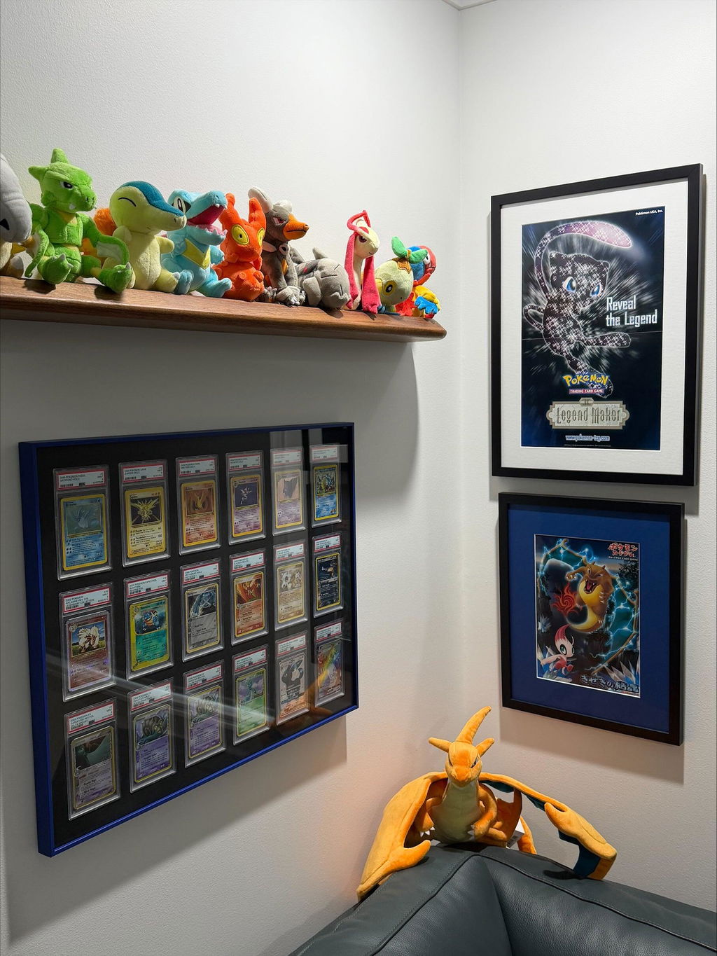
Repeating one frame colour across multiple displays is an effective way to connect collections that differ internally. A wall containing Pokémon, sports cards and video games can still look organised when the outer profiles align and share one finish.
Different frame colours can also be useful when they have an organising purpose. A collector might use black for graded cards, silver for One Touch cards and a warmer metallic colour for a separate game collection. In that case, variation communicates distinct groups.
If every display has a different finish and background, the wall may become visually fragmented. A practical compromise is to keep one element consistent: frame finish, background colour, outer dimensions or spacing between frames.
How to plan a themed collector wall without overmatching
A theme is easier to recognise when it is expressed through a few repeated choices. You do not need the wall, lights, frame and foam to match the same character or console colour.
- Choose the primary collection: for example, Pokémon first editions, a Halo series or a favourite football club.
- Identify one or two dominant colours already present in the artwork.
- Select a neutral background or frame finish to balance those colours.
- Use additional colours sparingly in the room, such as a print, desk accessory or light.
- View the entire composition before buying multiple display pieces.
This approach works for both budget shelves and fitted frames. The materials may change, but the same basic colour relationships remain useful.
Budget display methods and what colour control they offer
Collectors do not need a purpose-built frame to make considered colour choices. Existing shelving, inexpensive acrylic stands, small picture ledges and cabinets can all display cards or games effectively.
| Display method | Colour control | Best suited to | Main limitation |
|---|---|---|---|
| Existing shelf | Wall, shelf and accessories | Large collections and frequent rotation | Less uniform spacing |
| Individual clear stands | Background and stand arrangement | Small groups and favourite pieces | Multiple stands need aligning |
| Picture ledges | Ledge finish and wall colour | Casual decorative displays | Objects can overlap or shift |
| Display cabinet | Cabinet colour, shelves and lighting | Dust-conscious or mixed-object displays | Space, reflections and lighting need planning |
| Purpose-fitted aluminium wall frame | Outer finish, fitted background, grid layout | Structured, consistent presentations | Higher cost and format-specific fitting |
A shelf may be the right choice for a collection that changes weekly. A cabinet may be better for mixed boxes, figures and oversized editions. A fitted aluminium frame becomes relevant when the arrangement itself is intended to remain visually consistent and occupy a defined place on the wall. The higher price reflects a different kind of presentation, not a rule that other display methods are inadequate.
When a purpose-fitted aluminium frame changes the result
The visual difference between separate stands and one fitted wall frame becomes clearer as the number of items increases. Each individual stand must be positioned and aligned. A purpose-cut background establishes the layout and spacing as part of the display.
Aluminium also provides a defined perimeter that can match the rest of a room. When combined with black or white EVA foam and a coordinated background, the collection can appear more unified. This is particularly noticeable in groups of graded PSA, CGC or BGS slabs, One Touch holders and physical game cases that share one consistent format.
That consistency is one reason some collectors move from inexpensive storage to dedicated displays as a collection matures. It is a presentation preference, not an indication that every valuable object requires the most expensive frame available.
Colour coordination does not replace protection
A visually appealing frame should also be suitable for the item being displayed. Holder dimensions, secure fit, glazing properties, wall mounting and location still matter. A beautifully matched frame will not prevent fading if the collection receives excessive light, and colour-coordinated foam does not make an unsuitable holder opening safe.
For collections with significant monetary or sentimental value, think of presentation and preservation as two related but separate decisions. Select colours for appearance, then confirm the protective and practical details independently.
Before deciding: compare combinations in your own room
- Choose the exact cards or game cases rather than relying on unrelated example artwork.
- Place one item on black and then white paper to approximate the background effect.
- Compare frame finish samples or accurate product photographs under your usual room lighting.
- Check the colour against the wall, furniture and other frames.
- Consider how the combination looks with the collection you expect to own in a year, not only today.
- For a large grid, preview the whole arrangement instead of judging one item in isolation.
- Confirm holder or game-case compatibility, dimensions and mounting before ordering.
Five practical colour combinations
Colourful Pokémon cards in a modern room
Black aluminium with black EVA creates a restrained border around vivid card artwork. Silver with black EVA is an alternative if the wall is very dark or the collector wants a lighter metallic perimeter.
Black-and-white sports photography
Silver or titanium with white EVA can emphasise the monochrome artwork. Black with white EVA creates a stronger graphic border. The choice depends on whether the aim is subtle continuity or pronounced contrast.
Gold-foil or championship collection
Gold with black EVA can make a deliberate feature of the metallic border. A black frame may be preferable when the cards themselves already contain a great deal of gold and shine.
Nintendo game wall
Silver with black EVA can allow colourful Nintendo covers to stand out, while black with white EVA makes the individual case outlines clearer. For a brightly decorated gaming room, a neutral finish may prevent the display from competing with surrounding colour.
Mixed PlayStation and Xbox favourites
Titanium or black with black EVA can tie together different game art styles. Since case dimensions vary, compatible arrangements should be selected separately rather than assuming all cases can share one fitted opening.
Common display frame colour mistakes
- Choosing by one product image: studio lighting may not match the intended room.
- Matching every colour: too much repetition can overwhelm the collectibles.
- Ignoring the background: black versus white EVA can influence the result as much as the aluminium finish.
- Forgetting scale: a colour that works on one small frame may dominate a 36-item display.
- Assuming all metallic finishes are alike: titanium, silver, gold and bronze can shift noticeably under different lighting.
- Choosing aesthetics before compatibility: case and slab dimensions still determine which display construction will work.
- Overlooking future changes: a highly specific colour scheme may be less flexible if the collection is frequently rotated.
Frequently asked questions
What is the best colour for a trading card display frame?
Black and silver are adaptable choices for many mixed collections. The best option depends on the artwork, background colour, wall and room lighting.
Is black or white EVA foam better for displaying cards?
Black can create stronger perceived contrast around colourful cards. White can make the layout feel lighter and help define darker objects. Neither is universally better.
Does black foam protect trading cards better than white foam?
The colour alone is not a UV-protection specification. Assess material performance, front glazing and the display location separately.
What aluminium frame colour goes with Pokémon cards?
Black, silver and titanium are versatile for varied Pokémon artwork. Gold, bronze and coloured finishes can suit specific themed collections.
Should the frame match a Pokémon type or character?
It can, but a neutral frame often gives the artwork more attention. A single accent colour may work better than attempting to match every design element.
Do gold frames suit sports cards?
They can suit championship or trophy-themed displays. For mixed sports collections, black, silver or titanium may be easier to coordinate.
What is a good frame colour for PSA graded cards?
Most finishes can work visually. Pay attention to the slab's label, the artwork and the background colour, and select the correct fitted PSA configuration.
Do BGS and CGC slabs require different frame colours?
No. Their physical dimensions and labels may change how a display looks, but colour choice is aesthetic. Physical holder compatibility is a separate requirement.
What colours work for One Touch magnetic card holders?
Black and silver are commonly versatile. White backgrounds can also provide strong contrast with holders that have darker top closures.
What is the best frame colour for Nintendo Switch game cases?
Neutral black, silver or titanium often allows the colourful box art and red case elements to remain prominent. Other finishes can work in strongly themed rooms.
Should all frames on one wall match?
Matching finishes creates a unified appearance. Different finishes can also work when they identify separate categories and the spacing remains consistent.
Can I combine a black frame with white foam?
Yes. The dark outer border and light background produce a distinct graphic contrast.
Is silver with black foam a good combination?
It is a useful combination when the collection should appear against a dark background but the frame itself needs visible definition.
Should I choose a coloured frame for a large collection?
That depends on how prominent you want the perimeter to be. For large multi-grid layouts, a neutral finish is often easier to coordinate across many artworks.
Does a darker frame make a collection look more expensive?
Not inherently. Perceived quality comes from materials, fit, condition, spacing, lighting and the overall composition, not simply the darkness of the frame.
Does aluminium look different under LED lighting?
Yes. Metallic finishes and surrounding artwork can appear warmer or cooler under different light sources. Test the combination under your actual room lighting where possible.
Can I change from black to white foam later?
That depends on the specific frame construction and availability of compatible replacement components. Check with the manufacturer rather than assuming that every background can be swapped without adjustment.
Is the acrylic backing colour the same as the foam in SLABBED displays?
SLABBED coordinates the acrylic backboard colour with the chosen black or white EVA foam in its fitted aluminium displays. Confirm the available options on the individual product listing.
Does UV-resistant acrylic affect which frame colour I should choose?
The acrylic's optical finish can influence reflections and perceived clarity, but UV filtration and the aluminium's decorative colour are separate choices.
What is the simplest way to preview a frame colour?
View the actual collectibles against black and white backgrounds, then compare frame finish samples or accurate photographs near the intended wall under normal lighting.
Further reading
These resources provide background on mat colour, visual consistency and material choices in picture framing. Trading card and video game cases are different objects, but the general principles of contrast and restraint remain relevant.
- Logan Graphic: Mat styles and presentation choices
- Frame Today: Designer mat board and colour options
- SLABBED: Acrylic UV protection and technical specifications
Final thoughts
Choosing a display frame colour is ultimately about making a collection look coherent in the place where it will be seen. Black, silver and titanium are adaptable; gold, bronze and brighter colours can become intentional accents. The difference between black and white EVA foam is equally important because the background surrounds every card holder or game case.
Start with the artwork, decide what should stand out and preview the combination at the scale you actually intend to display. If a shelf or simple stand achieves the result you want, there is no reason to overcomplicate it. If your goal is a fixed, evenly spaced collection wall, a purpose-fitted aluminium frame offers additional control over finish, background and layout. The strongest result is the one that feels connected to the collection rather than drawing attention away from it.
Continue Exploring
These related guides explain display formats, protection and the ways different collectibles can be arranged.
Collector guides
-
The Ultimate Trading Card Display Guide
Compare shelves, stands, graded holders, wall frames and large collection displays. -
Best Trading Card Display Frames for Collectors
Understand materials, sizes, compatibility and different presentation styles. -
How to Display Video Game Cases
Ideas for PlayStation, Xbox and Nintendo collections, from basic storage to wall displays. -
UV Protection for Video Game Cases
Learn why light exposure and material specifications matter when displaying physical games. -
How to Display Graded Cards on a Wall
Practical layout choices for PSA, CGC and BGS collections.
Display collections
-
CardVault® Aluminium Trading Card Displays
Compare grid arrangements and frame finishes for trading card collections. -
SlabVault® Graded Slab Displays
Display layouts configured for PSA, CGC and BGS graded holders. -
MagVault® One Touch Displays
Fitted displays for magnetic trading card holders. -
GameVault™ Video Game Displays
Explore fitted layouts for selected PlayStation, Xbox and Nintendo game cases.

0 comments